Wealth management isn’t one-size-fits-all
Harness Investment Management provides access to institutional-quality investment solutions for advisors and investors, facilitating their success and helping them plan for the future.
Project
Website Redesign
Role
Product Design Lead
Design Strategy Lead
UX Researcher
Timeline
Q1 2023- Q4 2023
Design Process

Information hierarchy
Information is convoluted and disorganized, section titles are too vague to guide an unfamiliar user.
Look and feel
Site appearance is not reminiscent of a technology-first company. Muted tones and flat illustrations.
Language, tone
The content attempts to speak to two audiences at once and loses impact for both audiences as a result.
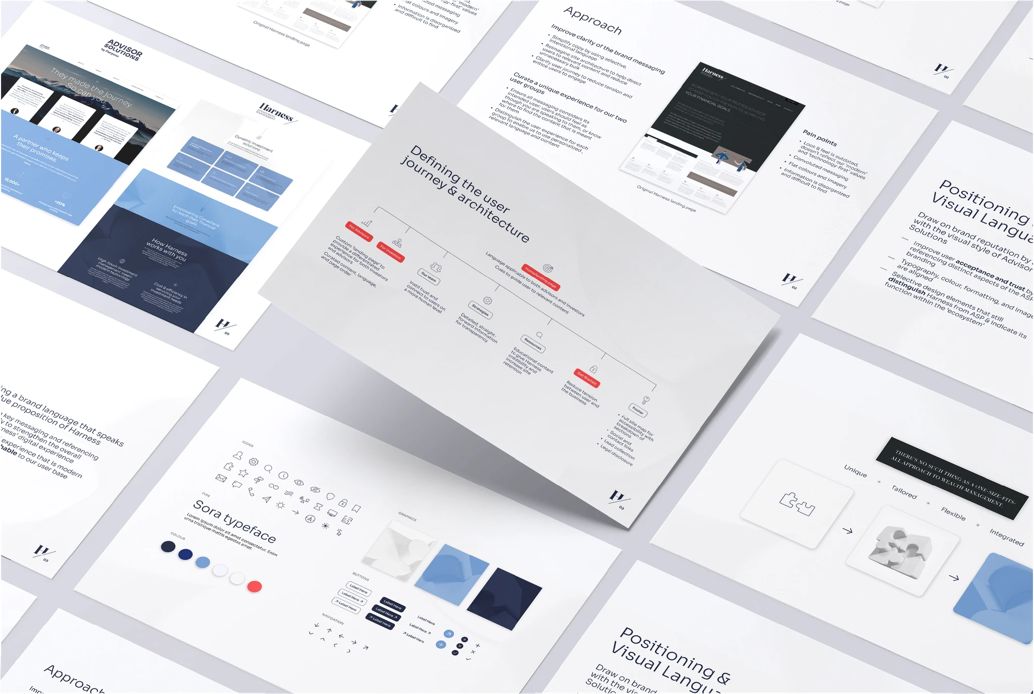
Approach
Work with stakeholders to identify the brand story. In alignment with the user journeys, improve message clarity and overall communication of ideas
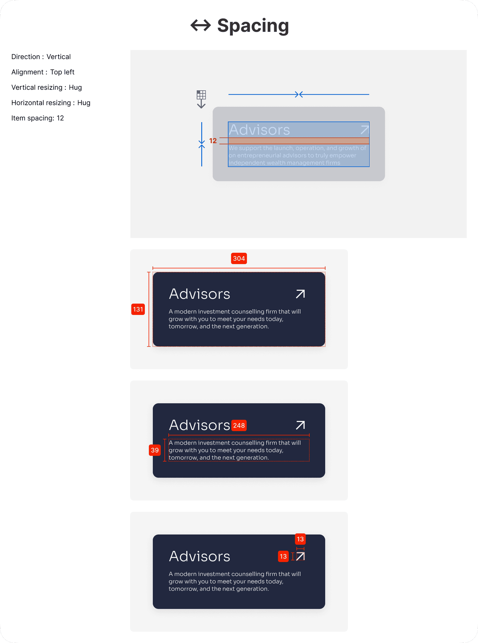
Increase attention to negative space
Improve the quality of text, while decreasing its volume
Employ visual cues to assist in storytelling
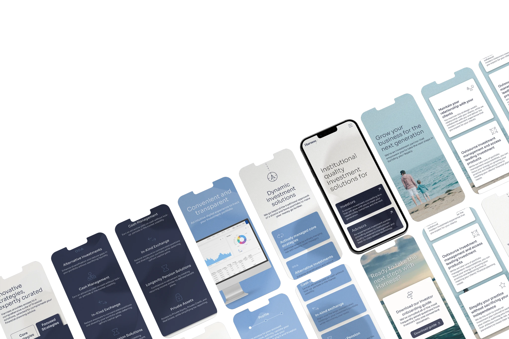
Update the look and feel of the site with a simplified, timeless design that resonates with our audience and feels more human.
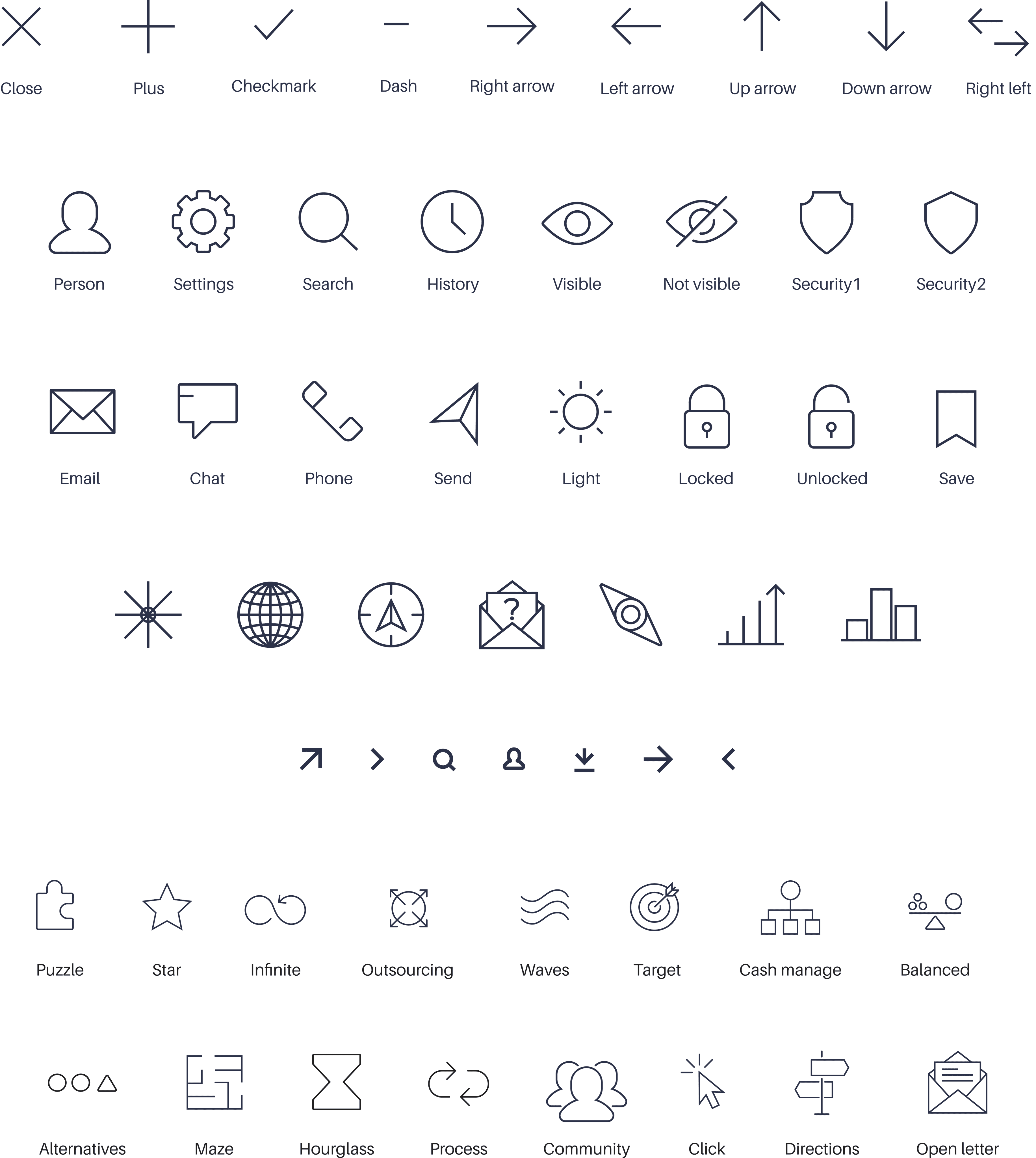
Swap out faceless illustrations for custom icons, graphics, and lifestyle photography
Improve site interactivity and delight users with thoughtful, non-disruptive motion design
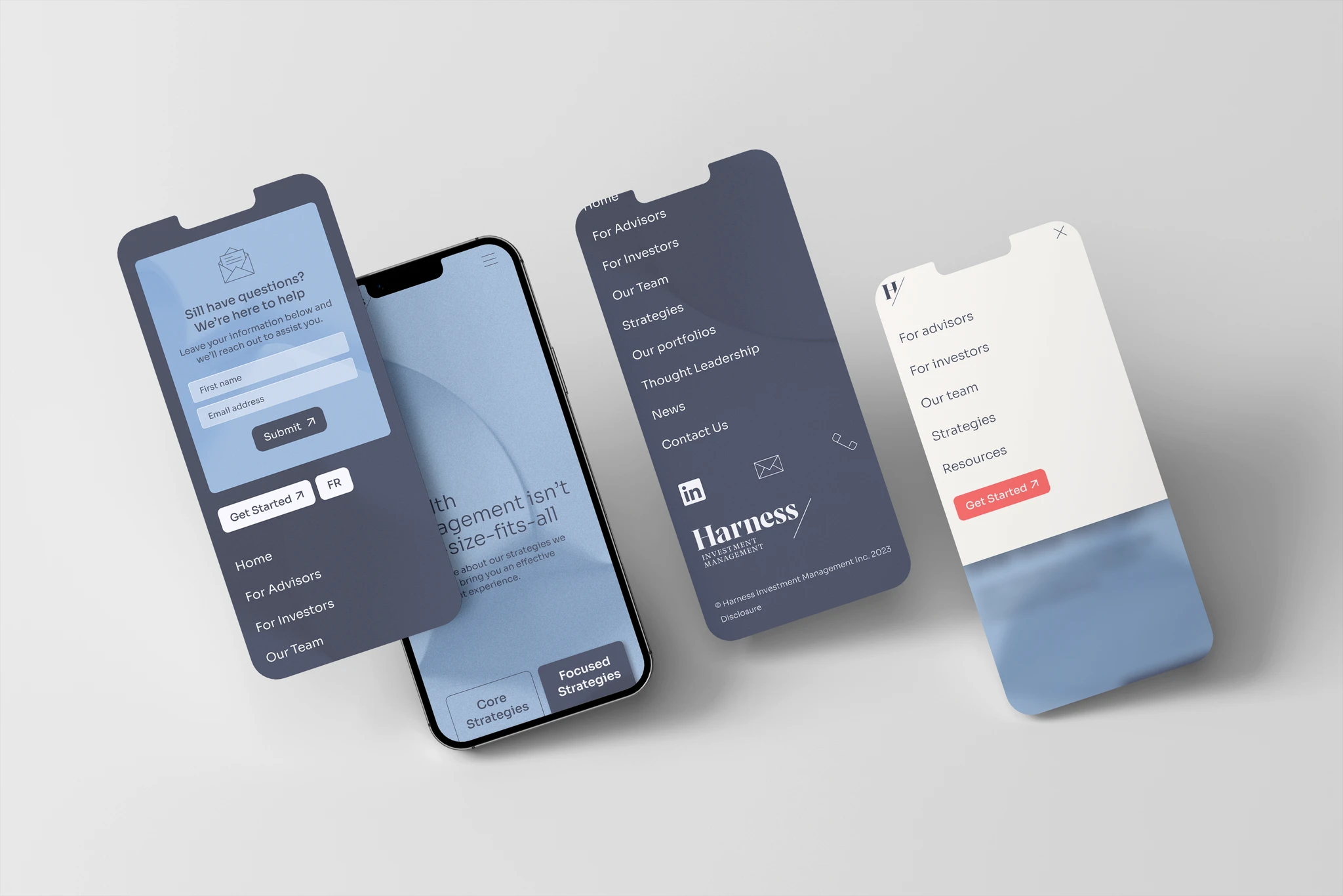
Evaluate our audience, their unique needs, and create clear user journeys for the relevant segments.
Encourage users to explore on the path curated for them by prompting with qualifiers (are you an investor or advisor?)
Create unique journeys for our two user segments to allow for targeted communication
Identify the desired actions of both clients and business, streamline navigation to these goals
Research, strategy
Audience positioning
Defining our audience using surveys, user interviews, stakeholder interviews, and competitive analysis.
User segments
User journey mapping
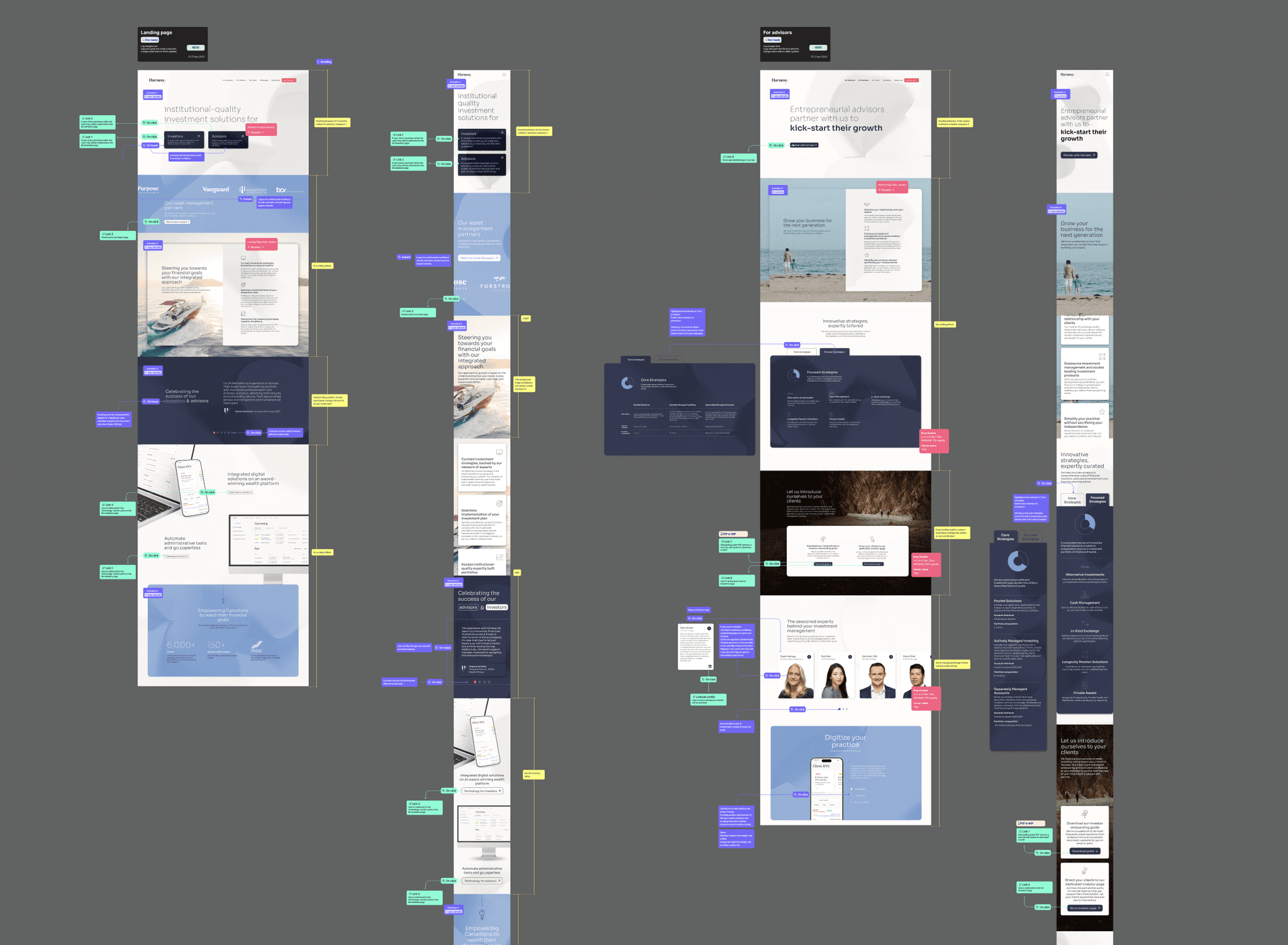
Site architecture
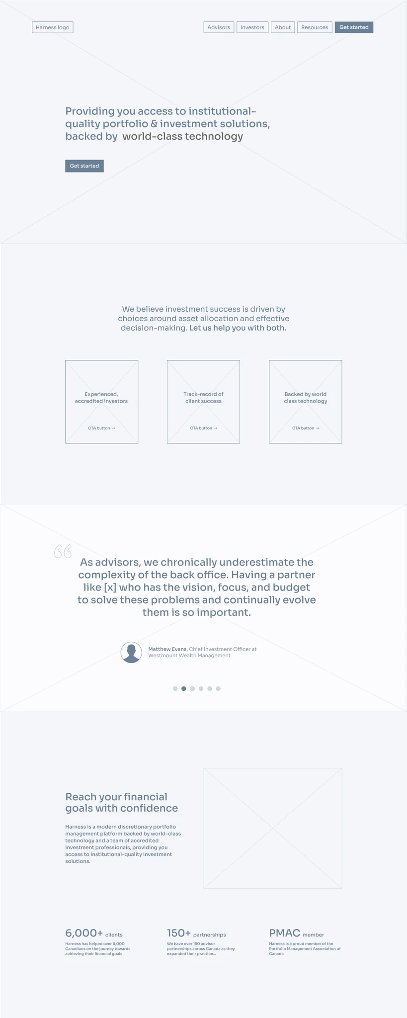
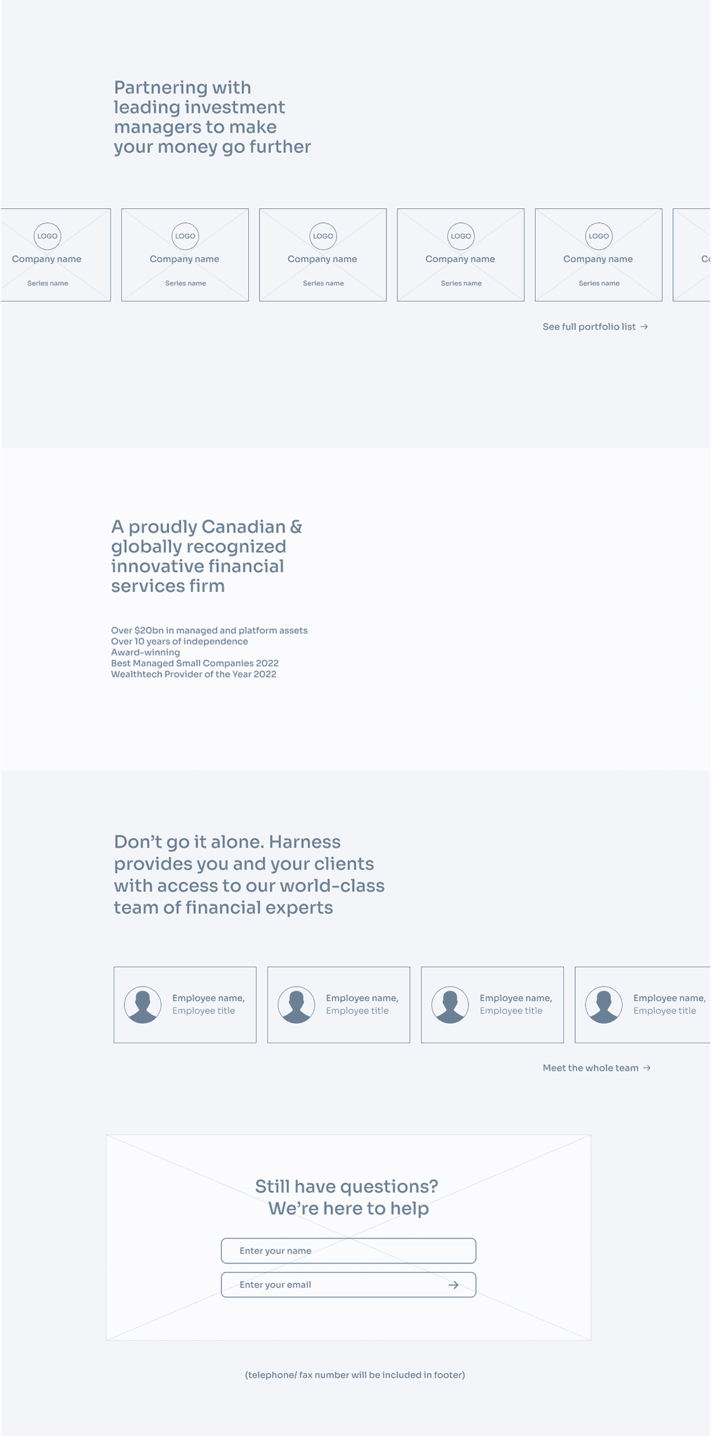
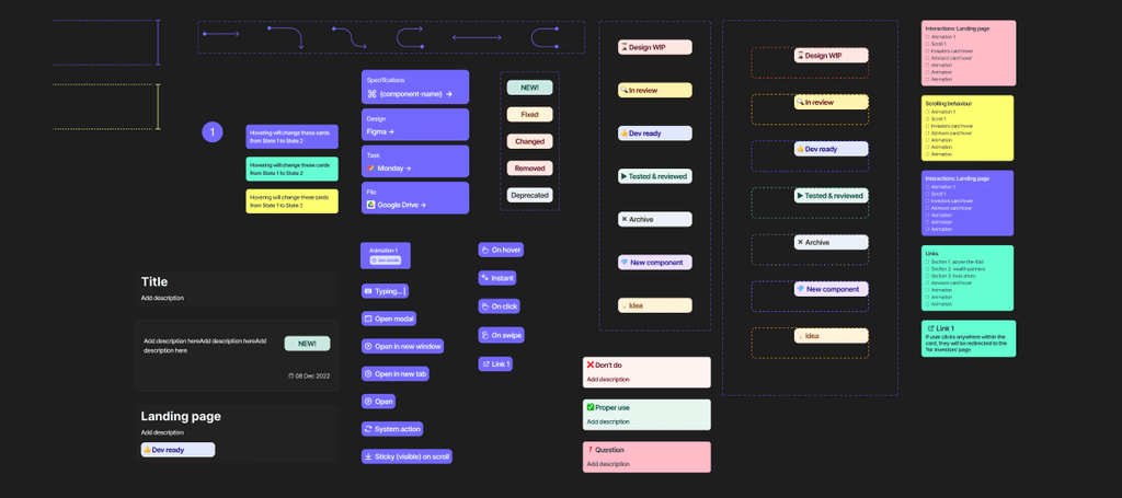
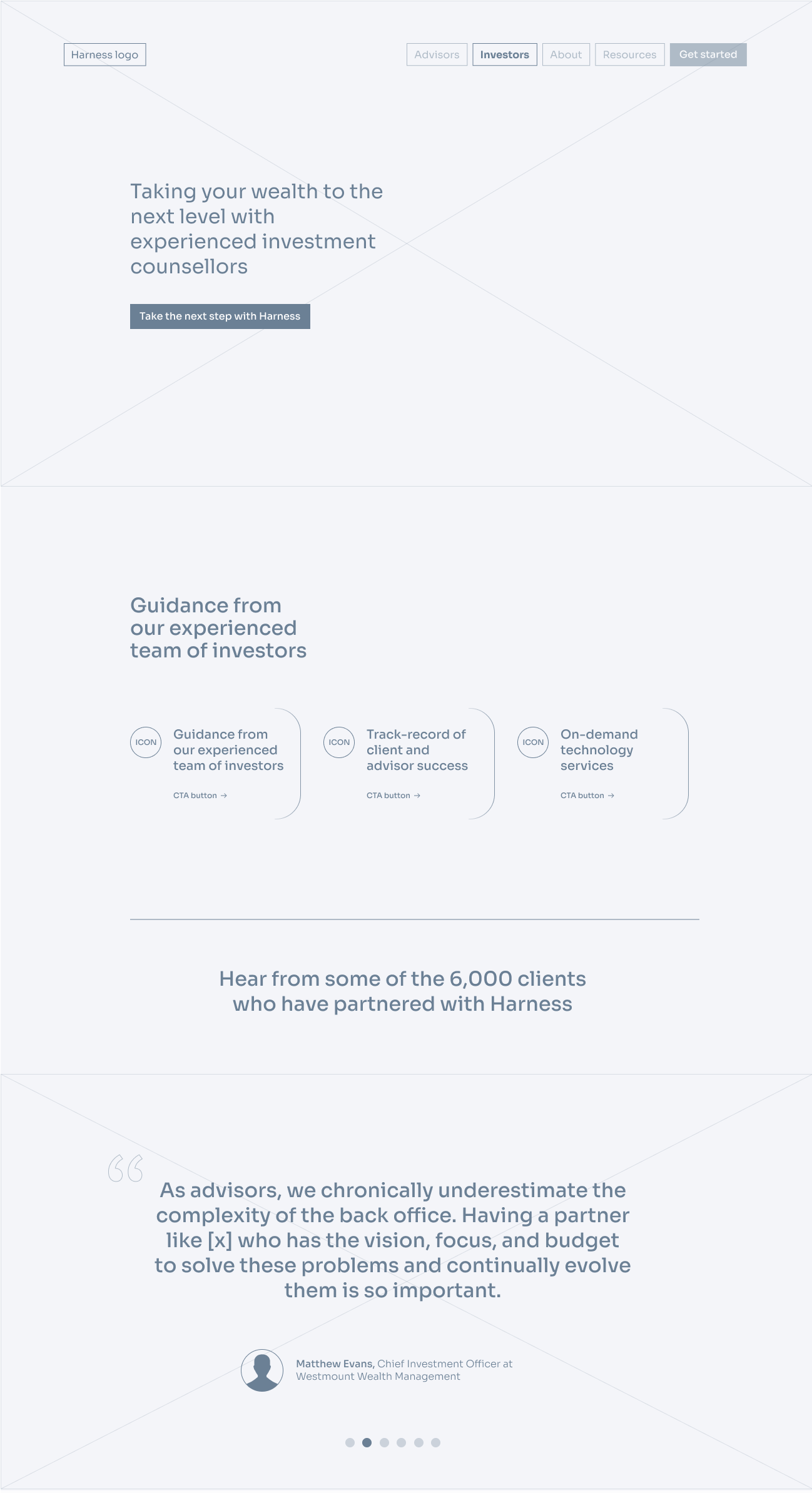
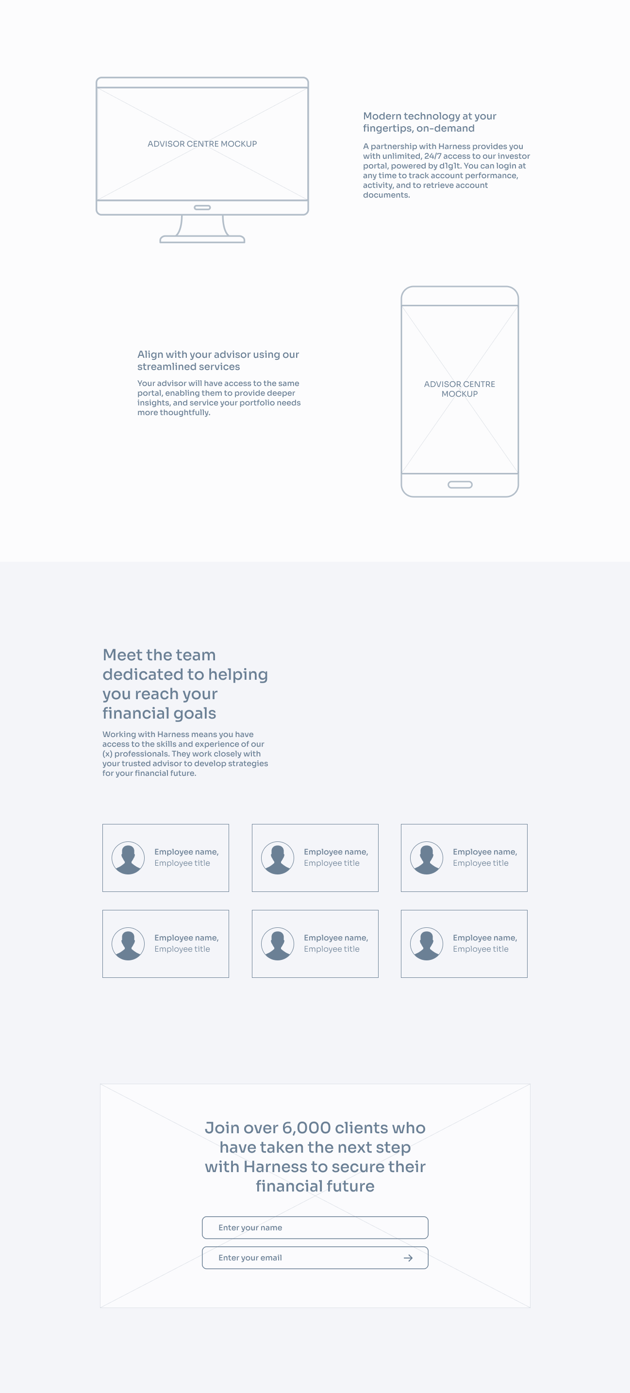
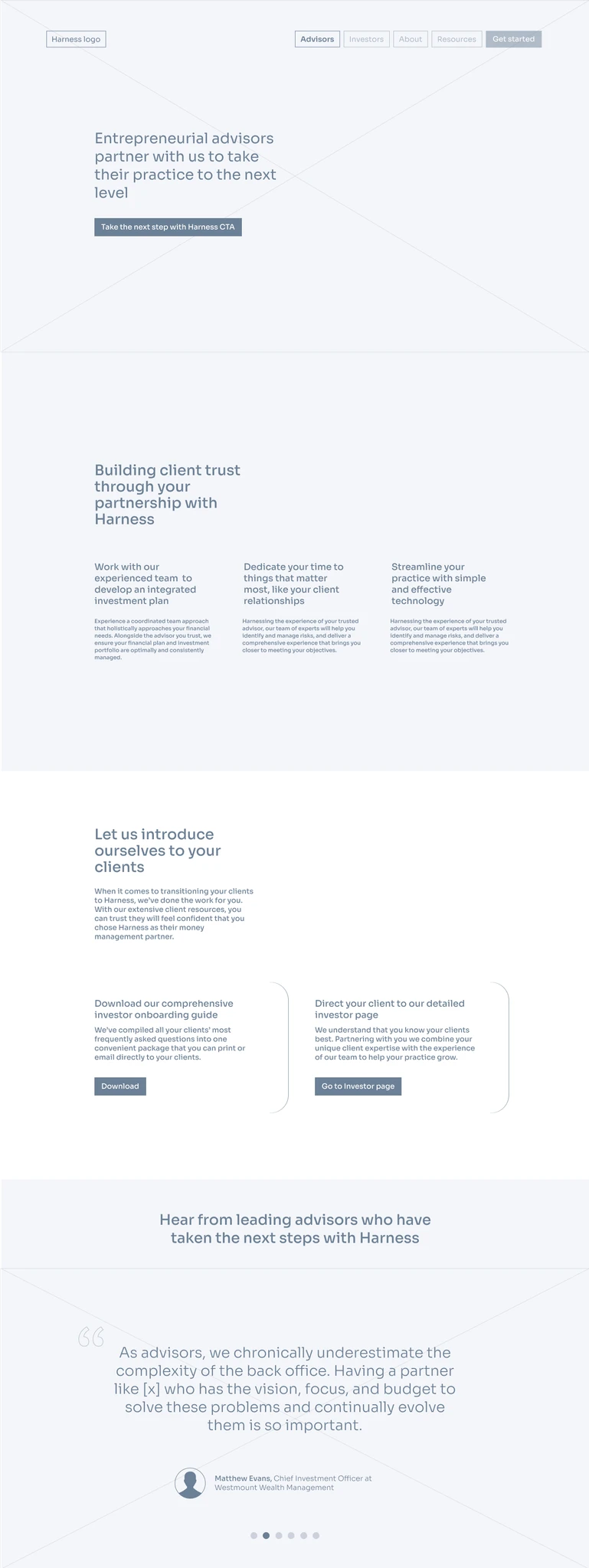
Feedback at this stage is key to an efficient design workflow, and I keep a standard kit to develop wireframes in a style that's clean, but visually indicates that these designs are just prototypes. If the wireframes are too polished or detailed, stakeholders will often confuse them for final designs or fixate on details that will be resolved in the high-fidelity stage.
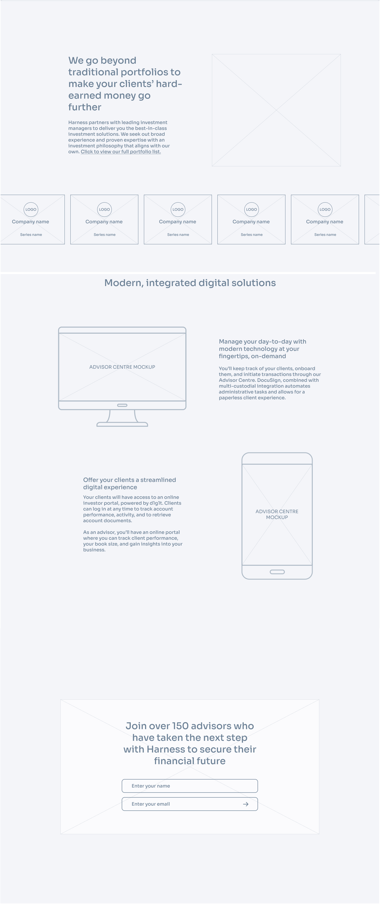
Moving to high-fidelity
Visual design
Colour story
Colours should align with parent company, Advisor solutions, but still be differentiated
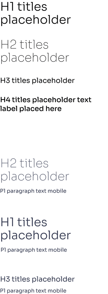
Type
Type was predetermined (Sora), an open-source typeface, applied predominantly in lighter weights to match with icon style
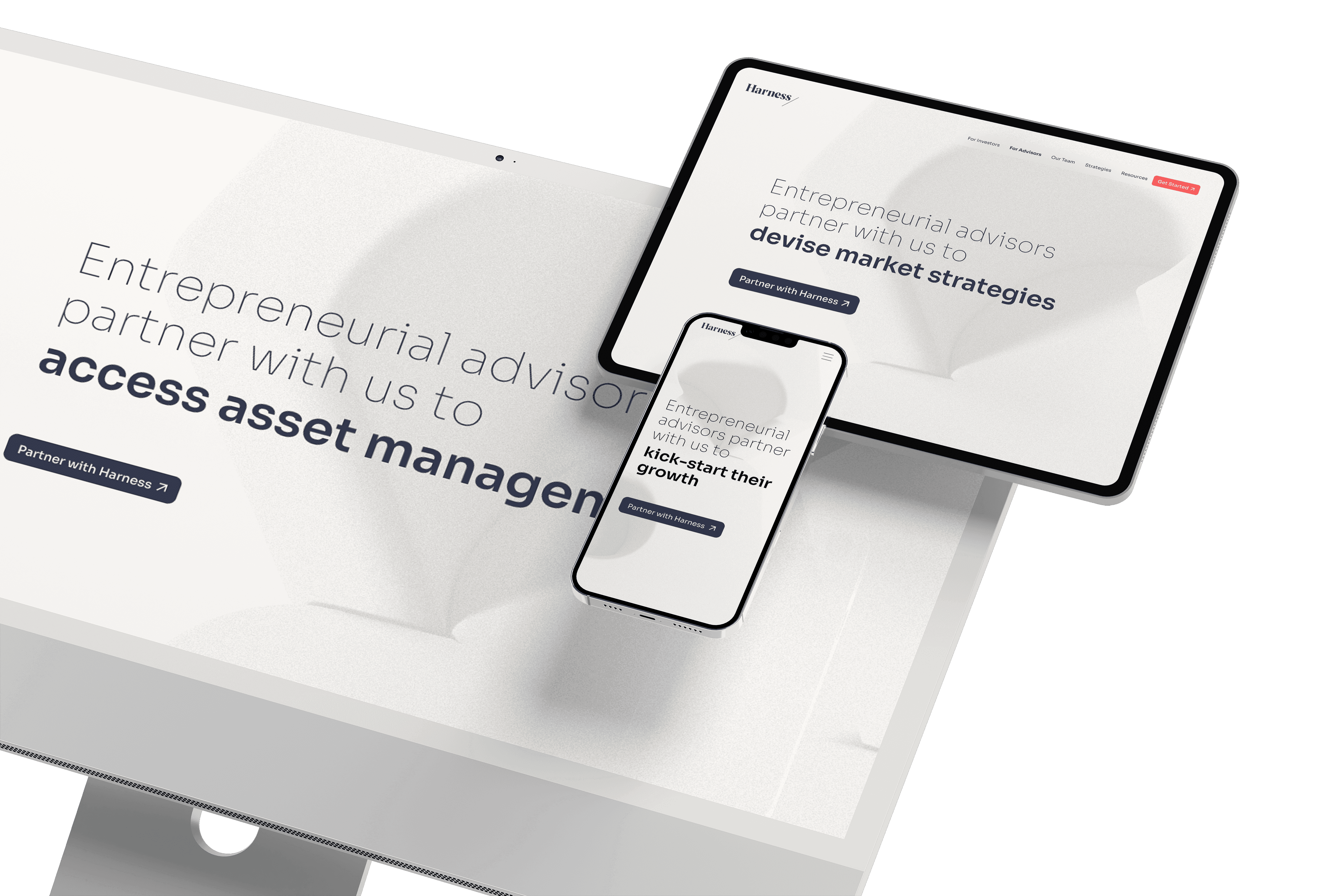
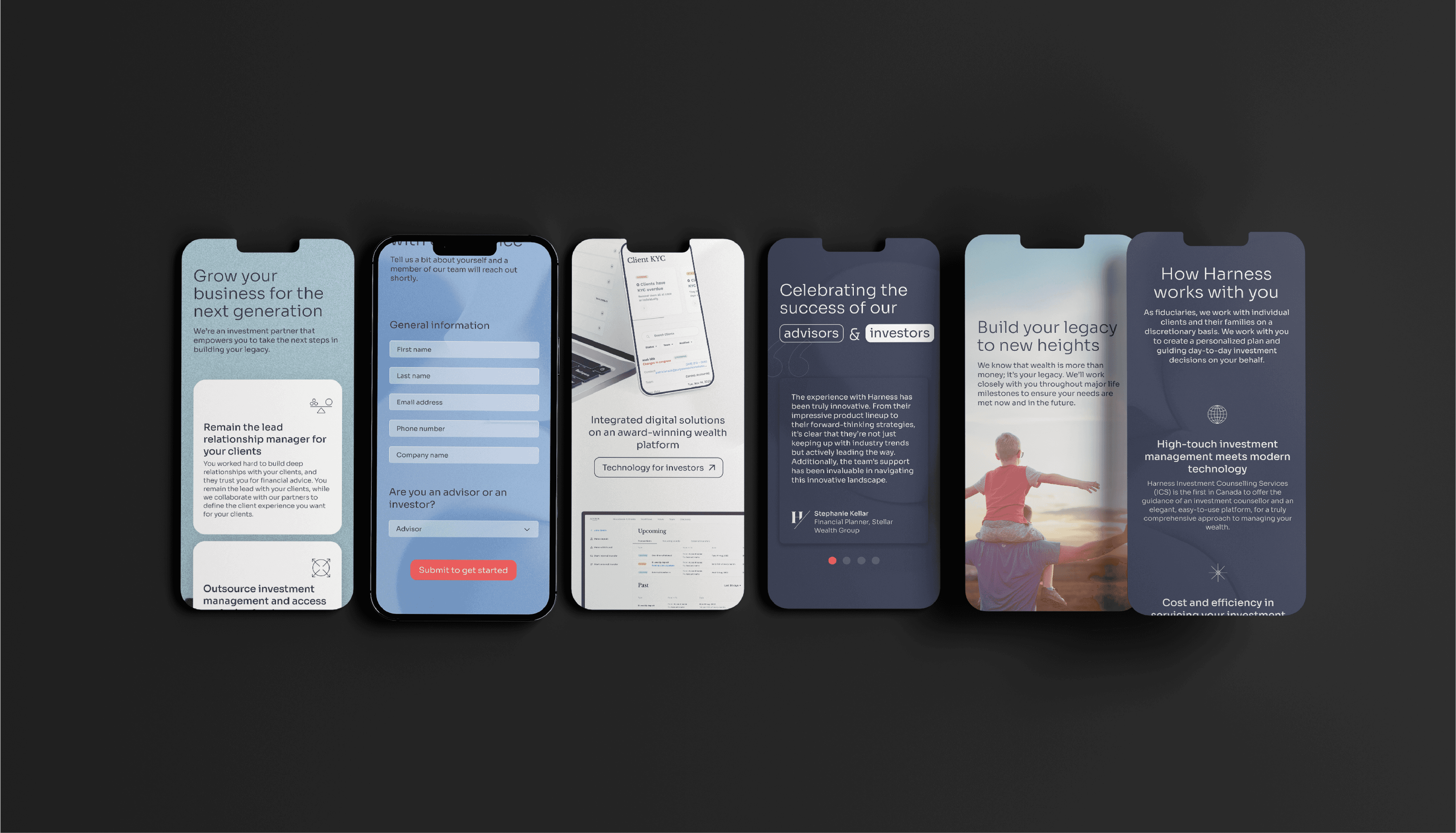
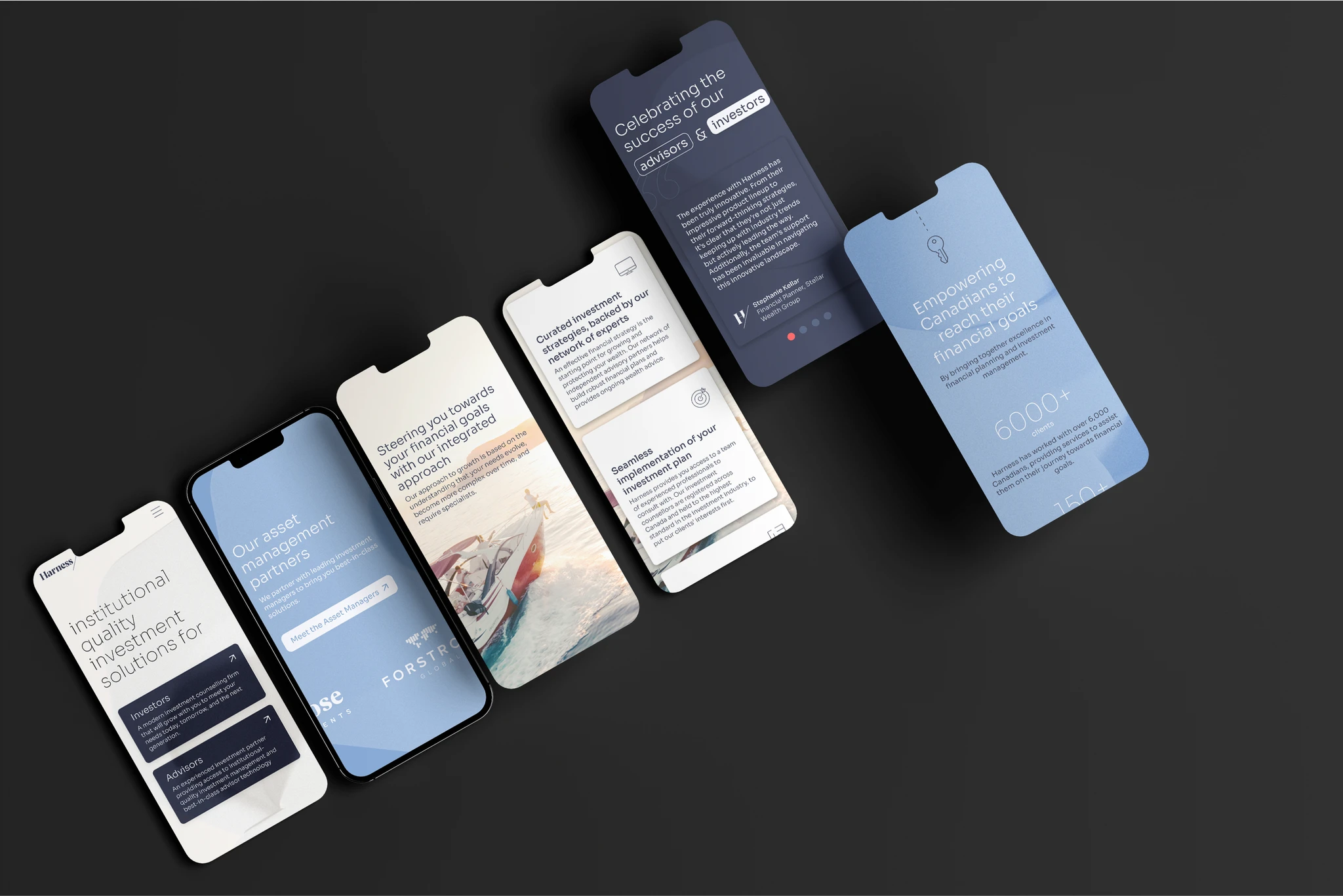
Imagery
Images were featured as a prominent graphic element throughout the site. It was important to curate a unique and consistent library of images; across compositions and subjects, allowing the images to aid in the storytelling that drives our user journeys
Audience context
Investor and advisor clients trend older (40+), have on average a lower technical fluency, and more classic aesthetic values
Visual cues that would be considered universal for a younger audience had to be user-tested (example: ghost buttons, carousel dots…)
Inspiration
Survey included questions about clients' favourite digital experiences, these were the first place I looked for reference
Iconic simple design inspiration from the past (Vintage IBM, Knoll, architecture, photographs)
Approach
Prior to completing high-fidelity designs, I went through another round of feedback, specific to the visual language
This step is atypical for my process, but in this instance I wanted to ensure that our aesthetic values were aligned
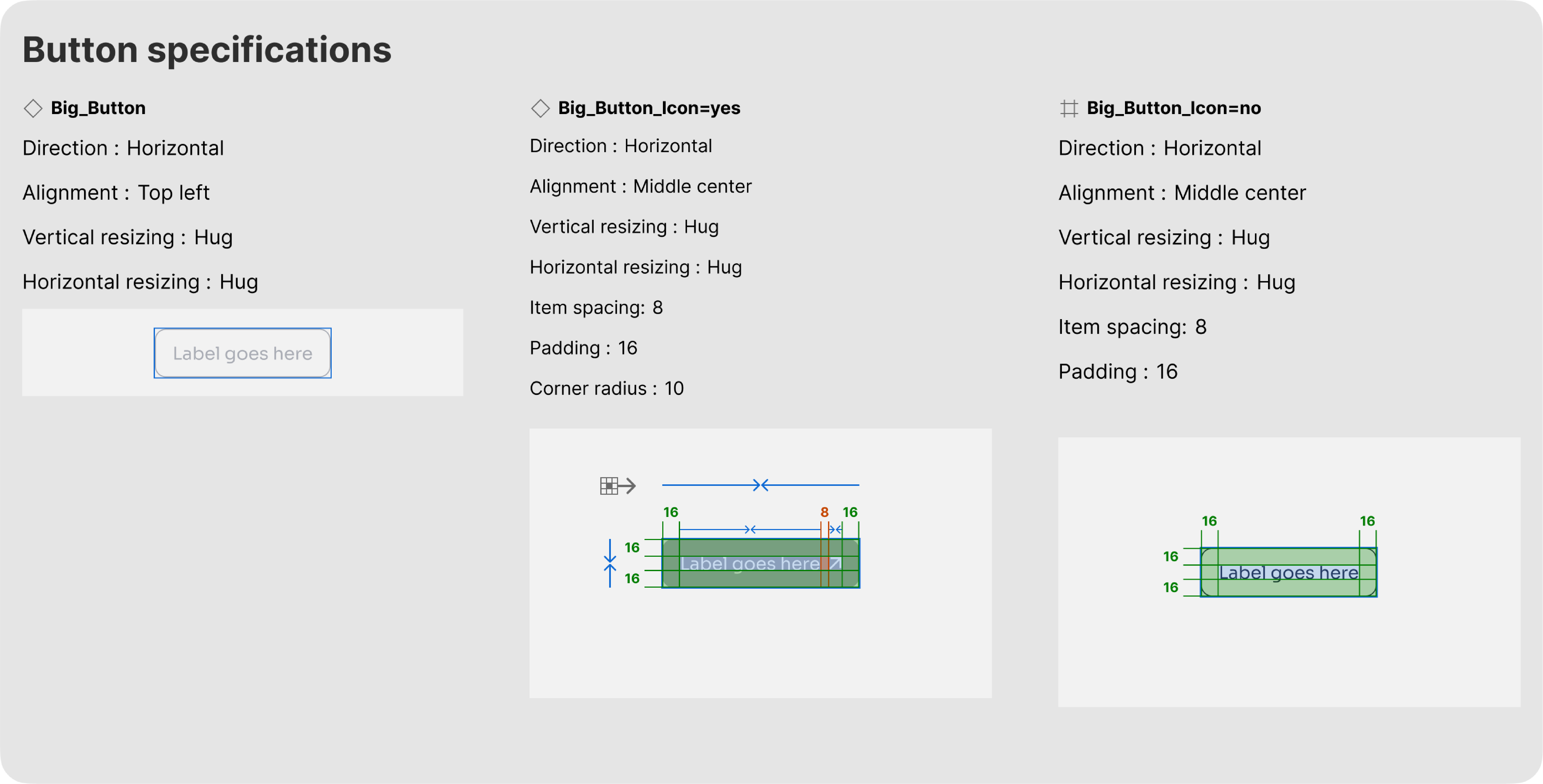
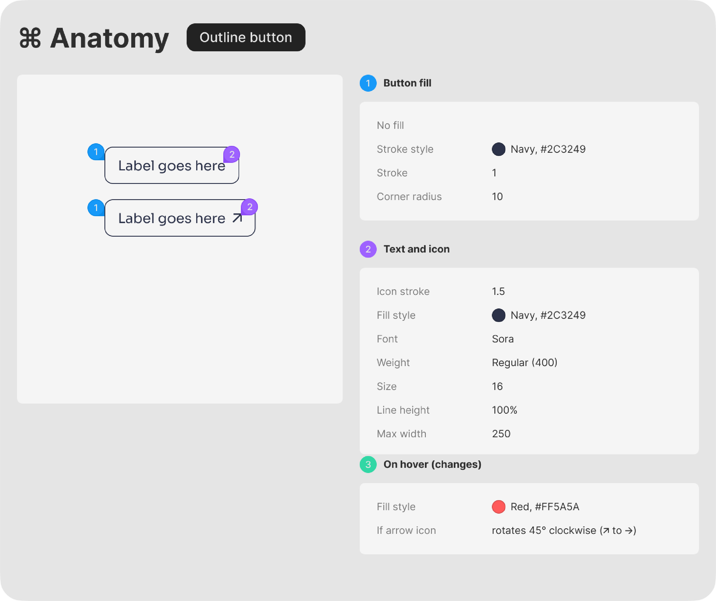
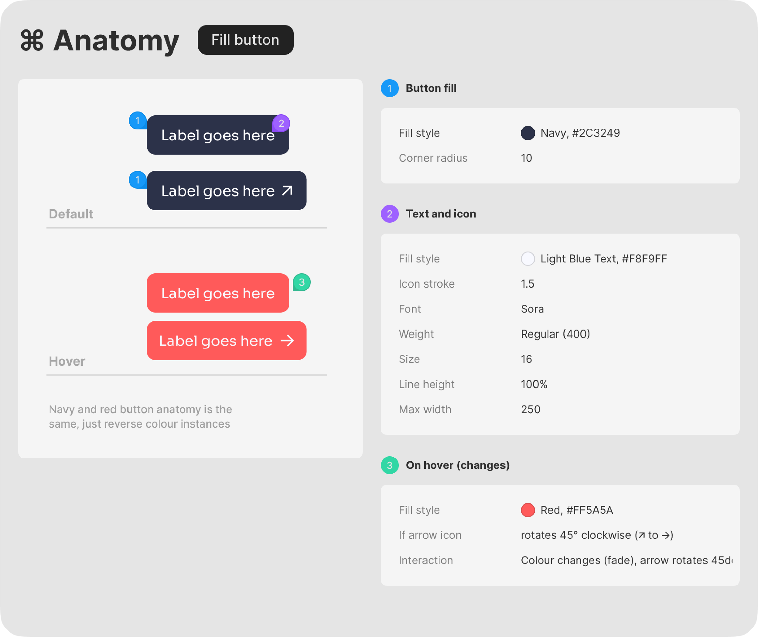
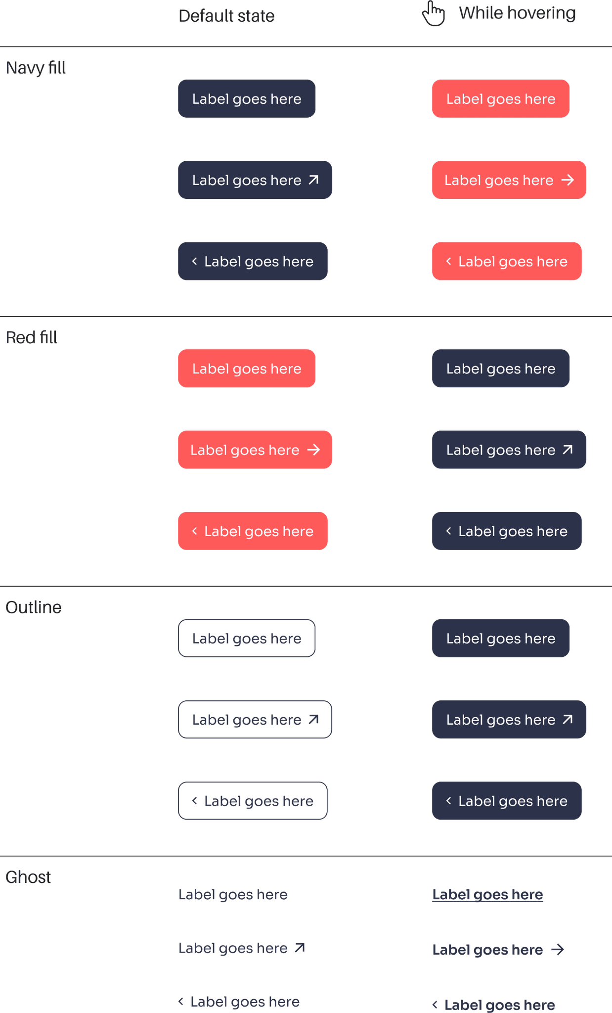
Design System
Vista Blue
#7DA3D3
#A3BBD9
#BDCDE0
#F8F9FF
Poppy
#FF5A5A
#FF9090
#FFCECE
#FFF0F0
Delft Blue
#2C3249
#5C6897
#808FCE
#ECEFFF
Cream
#FFFCF8
Dark
#424242
#373737
Grayscale
#9B9B9B

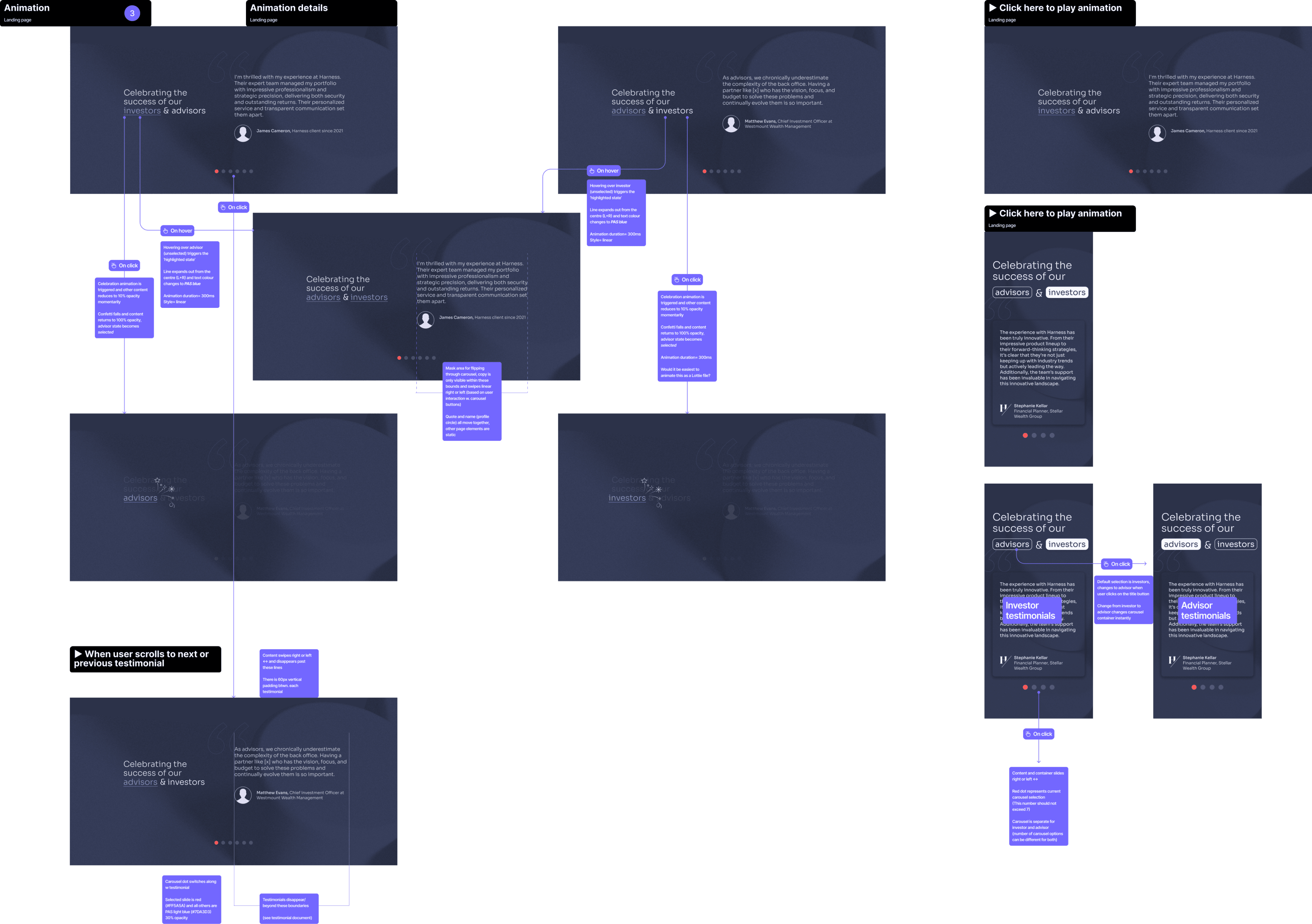

Moving to high-fidelity
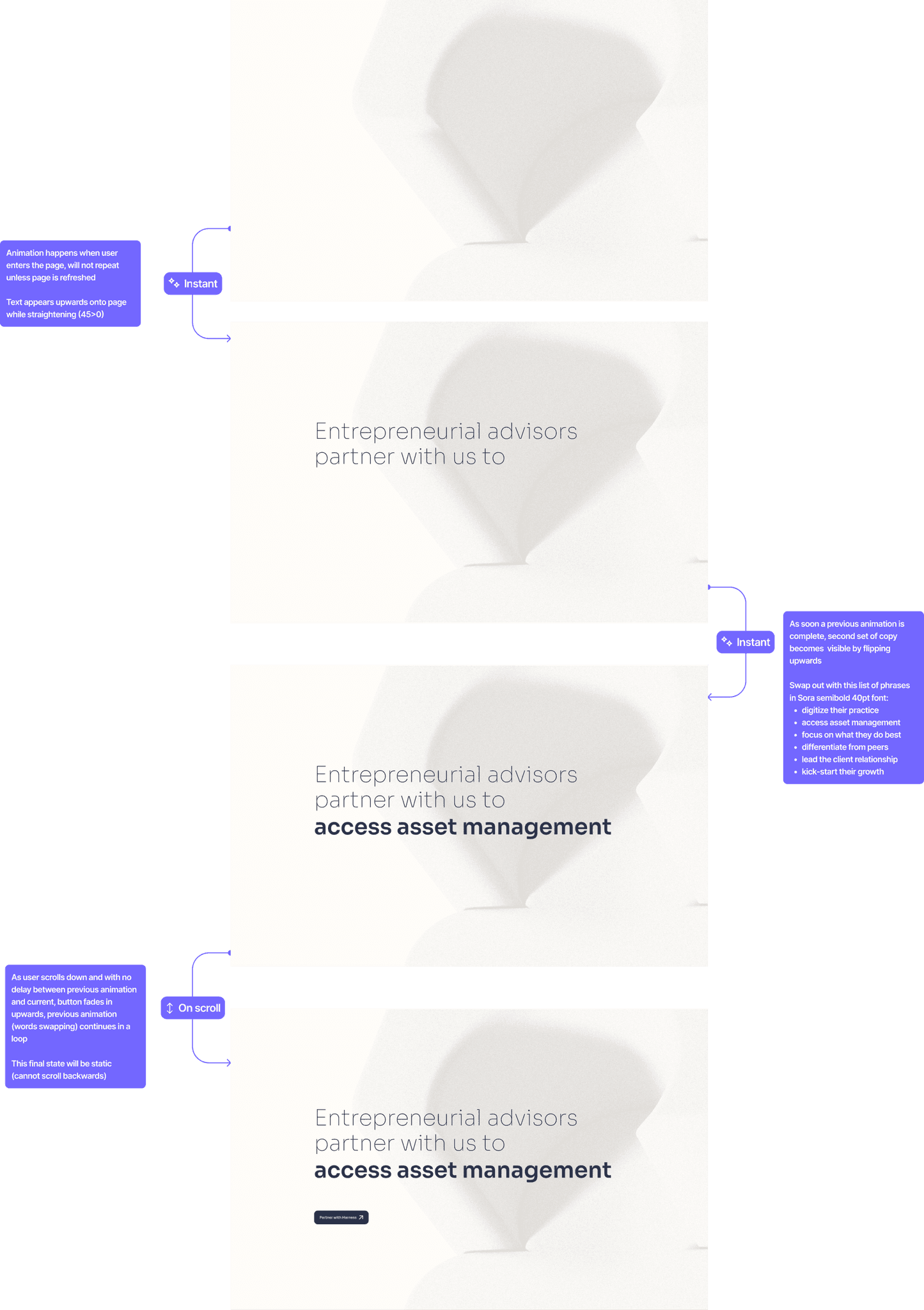
Motion design
Interactions
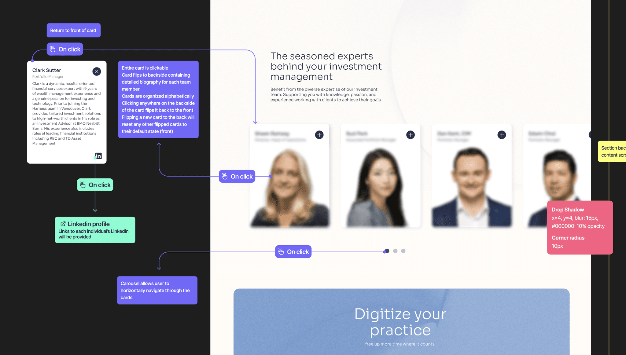
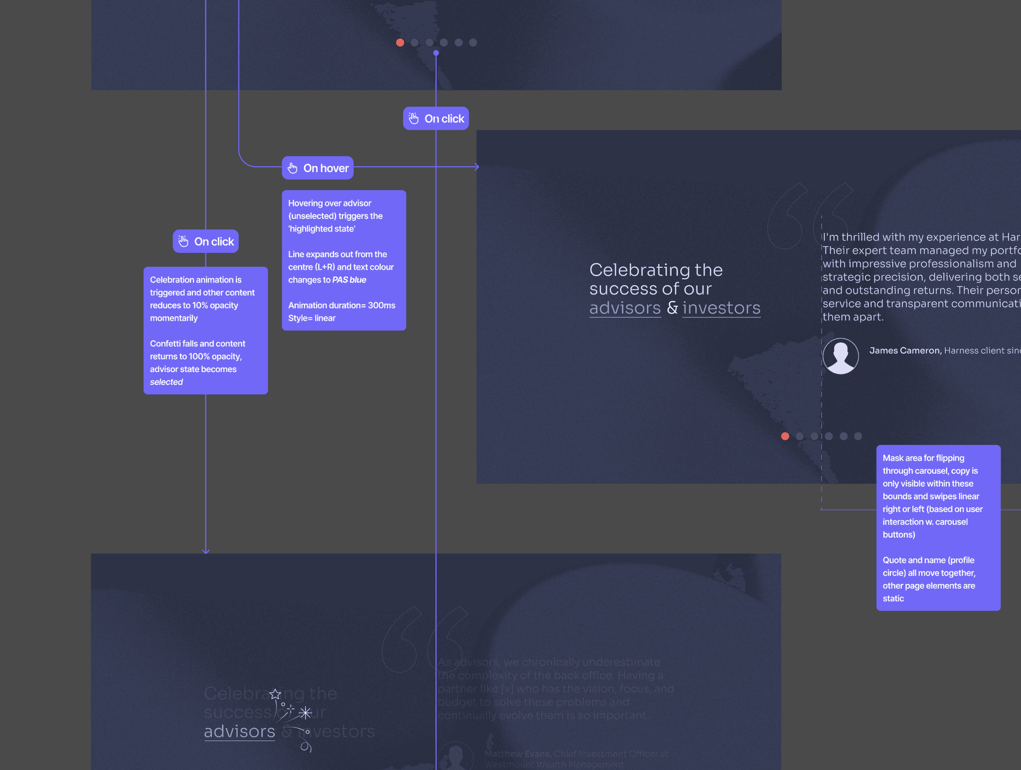
Simplicity of website allows for attention to subtle, satisfying hover, click, and scrolling interactions to enhance the user's immersion
Animations
Subtle, non-invasive motion that enhances the usability or facilitates more efficient communication of ideas
Transitions
Smooth scrolling
Entrance animation time delay